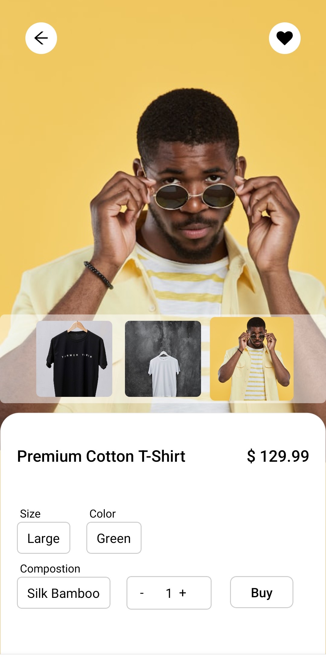
Components
import * as React from "react";
import {
Pressable,
Text,
View,
Image,
Animated as Animation,
PanResponder,
} from "react-native";
import FontAwesome from "react-native-vector-icons/FontAwesome";
import AntDesign from "react-native-vector-icons/AntDesign";
import { Dropdown } from "./dropdown";
type ItemsProps = {
price: number;
itemName: string;
sizeOptions: string[];
colorOptions: string[];
compositionOptions: string[];
imageData: { imgSrc: string }[];
};
type PanContext = {
startY: number;
};
export default ({
price,
itemName,
sizeOptions,
colorOptions,
compositionOptions,
imageData,
}: ItemsProps) => {
const [liked, setLiked] = React.useState<boolean | undefined>(false);
const [image, setImage] = React.useState<string | undefined>(
imageData[1].imgSrc,
);
const [size, setSize] = React.useState<string>("Large");
const [color, setColor] = React.useState<string>("Green");
const [composition, setComposition] = React.useState("Silk Bamboo");
const [quantity, setQuantity] = React.useState<number>(1);
const [isView, setIsView] = React.useState<boolean>(true);
const [isVisible, setIsVisible] = React.useState<boolean>(true);
const animatedValue = React.useRef(new Animation.Value(0)).current;
const panResponder = React.useRef(
PanResponder.create({
onStartShouldSetPanResponder: () => true,
onMoveShouldSetPanResponder: () => true,
onPanResponderMove: (evt, { dy }) => {
if (dy > 0) {
animatedValue.setValue(dy * 0.7);
}
},
onPanResponderGrant: () => {
animatedValue.extractOffset(); // Capture current offset for smooth continuation
},
onPanResponderRelease: (evt, { dy, vy }) => {
if (dy > 80 || vy > 0.5) {
setIsVisible(false);
Animation.timing(animatedValue, {
toValue: 500,
duration: 300,
useNativeDriver: true,
}).start();
setTimeout(() => {
setIsVisible(true);
}, 1000);
} else {
animatedValue.flattenOffset();
Animation.spring(animatedValue, {
toValue: 0,
useNativeDriver: true,
bounciness: 8,
}).start();
}
},
}),
).current;
const resetPosition = () => {
animatedValue.setValue(0);
Animation.spring(animatedValue, {
toValue: 0,
tension: 300,
useNativeDriver: true,
}).start();
setIsView(true);
};
return (
<View className="relative w-full h-full">
<View className="flex flex-row items-center justify-between px-8 mt-10 absolute top-5 w-full z-10">
<Pressable className="size-10 bg-white rounded-full flex items-center justify-center active:scale-105 ">
<AntDesign name="arrow-left" size={18} />
</Pressable>
<Pressable
className="size-10 bg-white rounded-full flex items-center justify-center active:scale-105 "
onPress={() => setLiked((prev) => !prev)}
>
<FontAwesome name="heart" size={18} color={liked ? "red" : "black"} />
</Pressable>
</View>
<Image
source={{ uri: image }}
className="mx-auto w-full h-full object-bottom "
/>
<View>
{/* top part */}
{isView && (
<View className="bg-white/50 w-full absolute bottom-80 mb-3 flex flex-row gap-4 items-center justify-center py-2 rounded-md ">
{imageData.map((el, id) => {
return (
<View
className={`size-24 rounded-md overflow-hidden ${image == el.imgSrc ? "scale-110" : "scale-100"}`}
key={id}
>
<Pressable onPress={() => setImage(el.imgSrc)}>
<Image
source={{ uri: el.imgSrc }}
className="w-full h-full"
/>
</Pressable>
</View>
);
})}
</View>
)}
{/* bottom part */}
<Animation.View
{...panResponder.panHandlers}
style={{
transform: [{ translateY: animatedValue }],
}}
onResponderStart={() => setIsView(false)}
className="w-full h-80 bg-white rounded-t-3xl border border-black/5 absolute bottom-0 z-20"
>
{/* item name and price */}
<View className="mx-5 mt-10 mb-5 flex flex-row justify-between items-center">
<Text className="text-xl font-medium">{itemName}</Text>
<Text className="text-xl font-medium">{`$ ${price}`}</Text>
</View>
{/* item details */}
<View className="w-80 h-fit pt-5 mx-5 ">
<View className="flex flex-row gap-5 items-center my-2">
<Dropdown
label="Size"
value={size}
options={sizeOptions}
onSelect={setSize}
/>
<Dropdown
label="Color"
value={color}
options={colorOptions}
onSelect={setColor}
/>
</View>
<View className=" flex flex-row gap-5 items-center ">
<Dropdown
label="Compostion"
value={composition}
options={compositionOptions}
onSelect={setComposition}
/>
<Pressable className="flex flex-row gap-2 items-center justify-center border border-black/20 px-4 py-2 rounded-md mt-5">
<Pressable
className="size-6 "
onPress={() => {
if (quantity > 1) {
setQuantity(quantity - 1);
}
}}
>
<Text>-</Text>
</Pressable>
<Text className="text-center">{quantity}</Text>
<Pressable
className="size-6 "
onPress={() => setQuantity(quantity + 1)}
>
<Text>+</Text>
</Pressable>
</Pressable>
</View>
</View>
{/* add to cart button */}
<Pressable className="absolute right-10 bottom-[63px] w-20 border border-black/20 h-fit py-2 rounded-lg active:scale-105 ">
<Text className=" text-black text-center text-md font-medium m-auto">
Buy
</Text>
</Pressable>
</Animation.View>
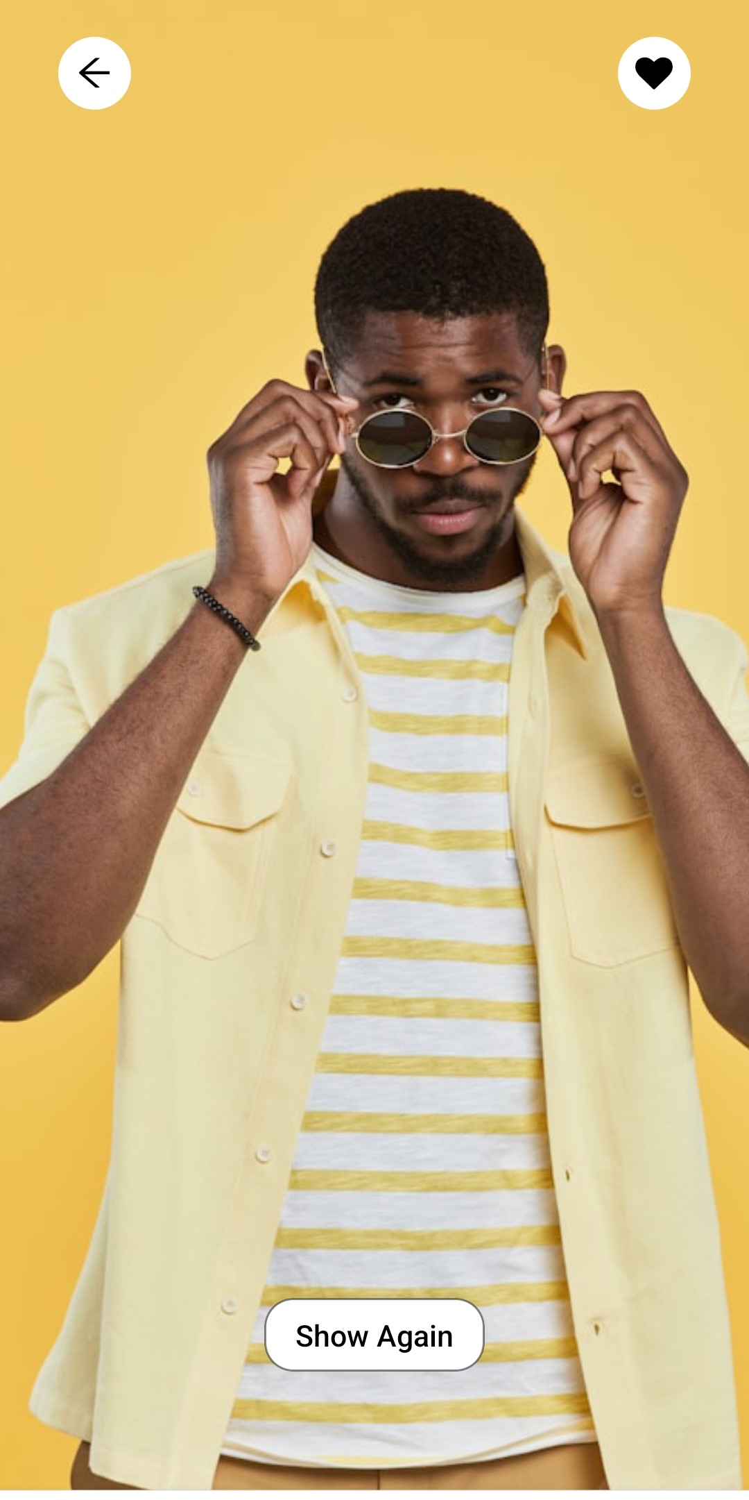
<View className="absolute bottom-20 w-full z-10">
<Pressable
className="py-2 px-4 bg-white w-fit border border-black/50 mx-auto rounded-2xl active:scale-105 "
onPress={resetPosition}
>
<Text className="text-center font-medium">Show Again</Text>
</Pressable>
</View>
</View>
</View>
);
};
Installation
npx solui@latest add item-cartInstall dependencies
pnpm add nativewind react-native-reanimated@~3.17.4 react-native-safe-area-context@5.4.0 --dev tailwindcss@^3.4.17 prettier-plugin-tailwindcss@^0.5.11 react-native-vector-icons Copy the code
Copy the code from the Code tab above into components/ui/item-cart.tsx.
Update imports
Update the imports to match your project structure.
Usage
import ItemCart from '@/components/ui/item-cart';

export default function InfoBadgeDemo() {
  return <ItemCart
                price={dummyData.price}
                itemName={dummyData.itemName}
                sizeOptions={dummyData.sizeOptions}
                colorOptions={dummyData.colorOptions}
                compositionOptions={dummyData.compositionOptions}
                imageData={dummyData.imageData}
            />;
}
Props
| Prop Name | Type | Default | Description |
|---|---|---|---|
| price | number | 230 | Price of the item |
| itemName | string | Printed Shirt | Name of the item |
| sizeOptions | string [] | Large | Size of the item |
| compositionOptions | string [] | Silk Bamboo | composition of the item |
| colorOptions | string [] | Green | Color of the item |
| imageData | {imgSrc: string []} | - | images of the item |