Components
import React, { useState } from "react"
import { View, Text, Pressable} from "react-native"
import AntDesign from 'react-native-vector-icons/AntDesign';

export function InfoBadge({ info = "Buy Coffee" }: { info: string }) {
  return (
      <View className=" w-64 h-60 bg-black/5 rounded-2xl p-1">
          <View className="w-full h-full bg-white border border-neutral-300 rounded-[12px] flex items-center justify-center ">
              <Text>
                  <AntDesign name="warning" size={20} />
              </Text>
              <Text className="font-semibold">
                  To your attention!
              </Text>
              <Text className="text-neutral-500 text-xl my-1">
                  {
                      info
                  }
              </Text>
              <View className="w-48 bg-black/5 py-1 px-1  my-5 rounded-md mb-0 ">
                  <Pressable className="relative bg-green-100/80 px-5 py-2 w-fit rounded-md flex flex-row justify-end  ">
                      <Text className="font-semibold">
                          Accept
                      </Text>
                  </Pressable>
                  <Pressable className="absolute top-1 h-full w-20 shadow-sm border border-black/5 bg-white px-3 rounded-md active:translate-x-[96px]">
                      <View className="absolute inset-0 border-r border-black/50  right-10 top-1 bottom-1">

                      </View>
                      <View className="absolute inset-0 border-r border-black/50  right-8 top-1 bottom-1">

                      </View>
                      <View className="absolute inset-0 border-r border-black/50  right-6 top-1 bottom-1">

                      </View>
                      <View className="absolute inset-0 border-r border-black/50  right-4 top-1 bottom-1">

                      </View>
                  </Pressable>

              </View>
          </View>
      </View>
  )

}
Installation
npx solui@latest add badgeInstall dependencies
pnpm add nativewind react-native-reanimated@~3.17.4 react-native-safe-area-context@5.4.0 --dev tailwindcss@^3.4.17 prettier-plugin-tailwindcss@^0.5.11 react-native-vector-icons Copy the code
Copy the code from the Code tab above into components/ui/badge.tsx or components/ui/info-badge.tsx .
Update imports
Update the imports to match your project structure.
Usage
import { InfoBadge } from "@/components/ui/infoBadge";
export default function InfoBadgeDemo() {
return <InfoBadge info="Buy Coffee" />;
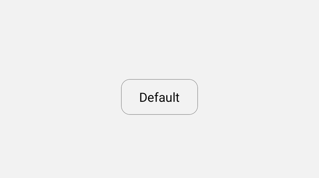
}Default badge
import { DefaultBadge } from '@/components/badges/badge1';

export default function DefaultBadgeDemo() {
  return <DefaultBadge BadgeValue="Default" />;
}npx solui@latest add badge-1Spinning badge
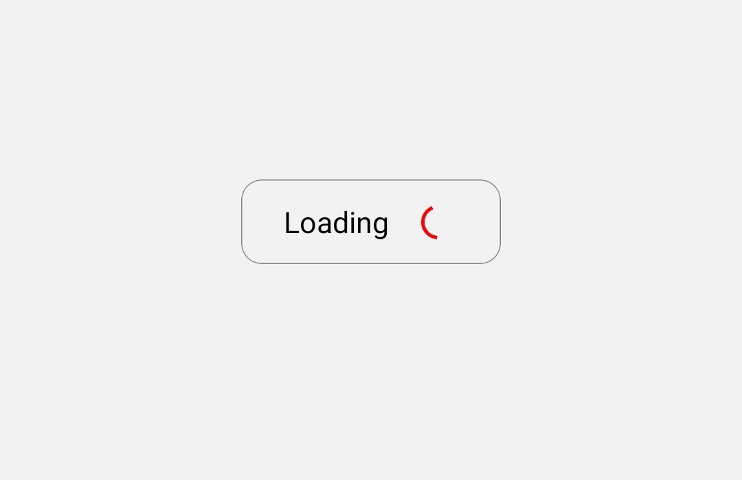
import { SpinningBadge } from '@/components/badges/badge2';

export default function SpinningBadgeDemo() {
  return <SpinningBadge BadgeValue="Loading" />;
}npx solui@latest add badge-2Count badge
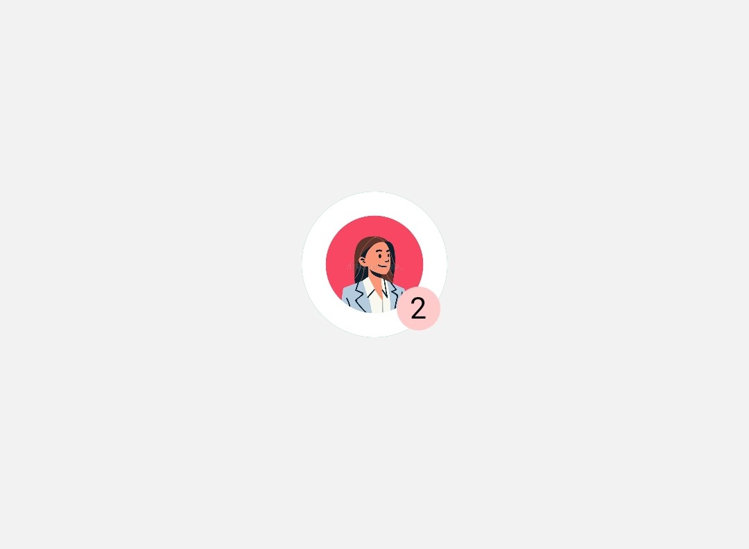
import { CountBadge } from '@/components/badges/badge3';

export default function CountBadgeDemo() {
  return <CountBadge Count={2} imgUrl="default.jpg"/>;
}npx solui@latest add badge-3Warning badge
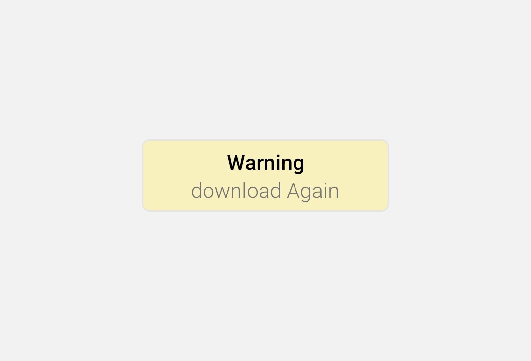
import { WarningBadge } from "@/components/ui/WarningBadge";

export default function WarningBadgeDemo() {
  return <WarningBadge title="Download again" />;
}npx solui@latest add badge-4Error badge
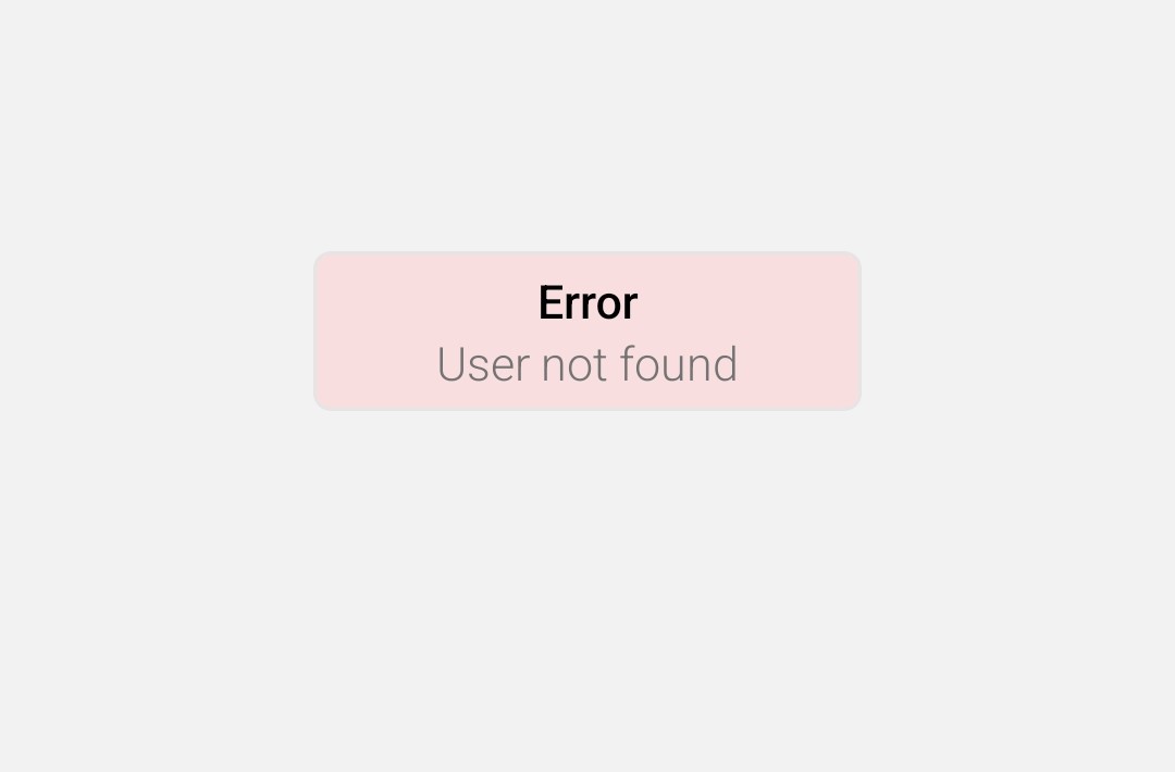
import { ErrorBadge } from "@/components/ui/ErrorBadge";

export default function ErrorBadgeDemo() {
  return <ErrorBadge title="User not found" />;
}npx solui@latest add badge-5